HOKA
fly human fly
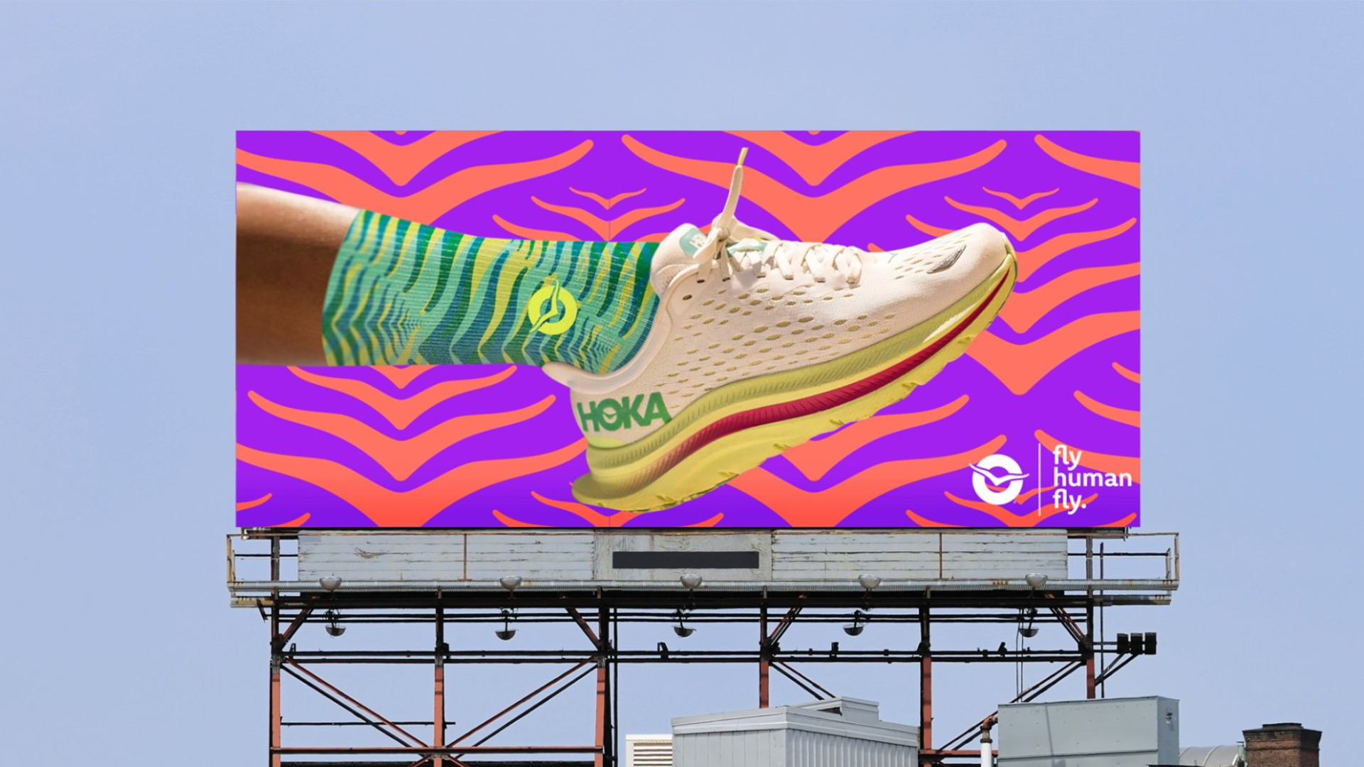
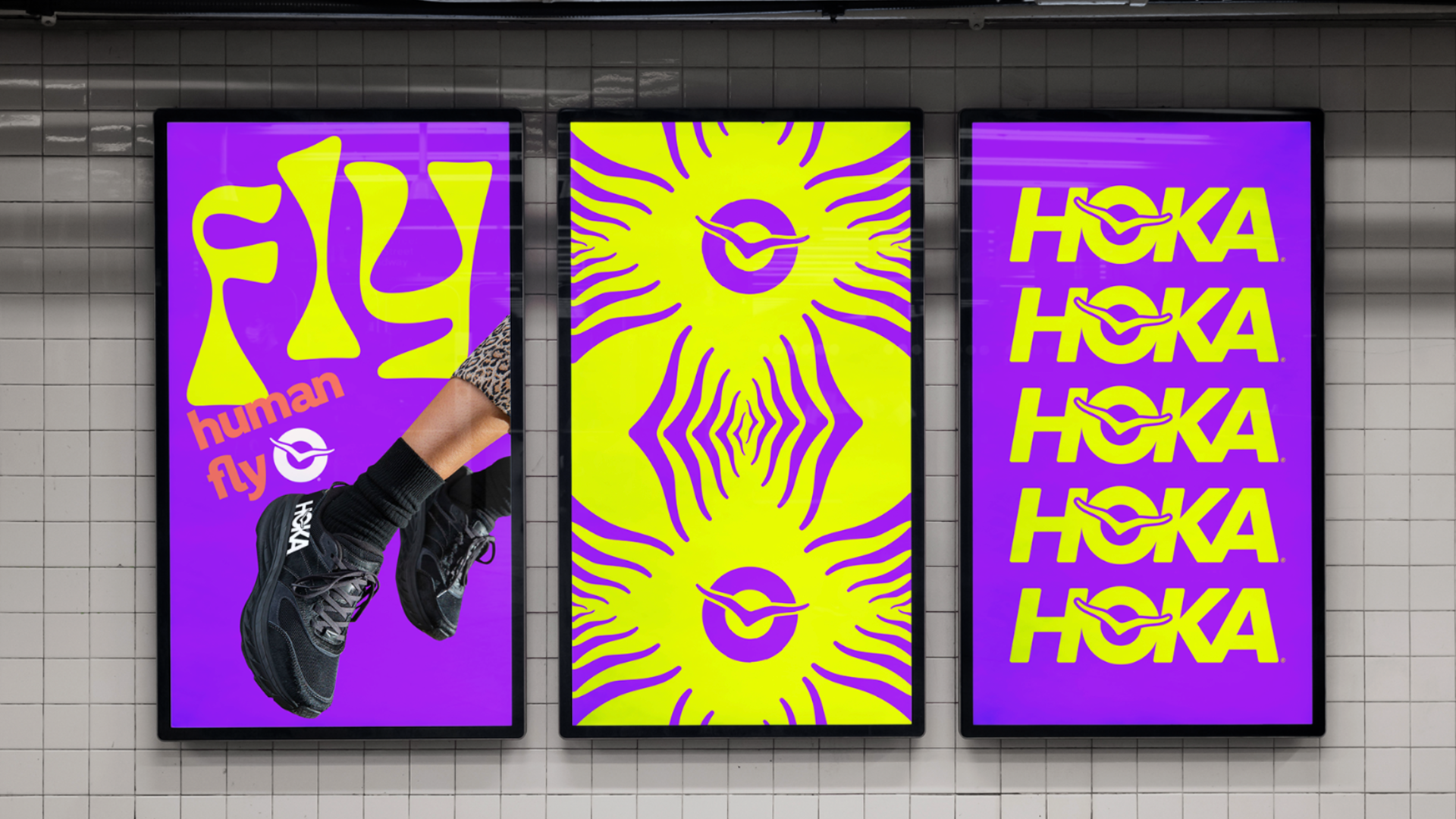
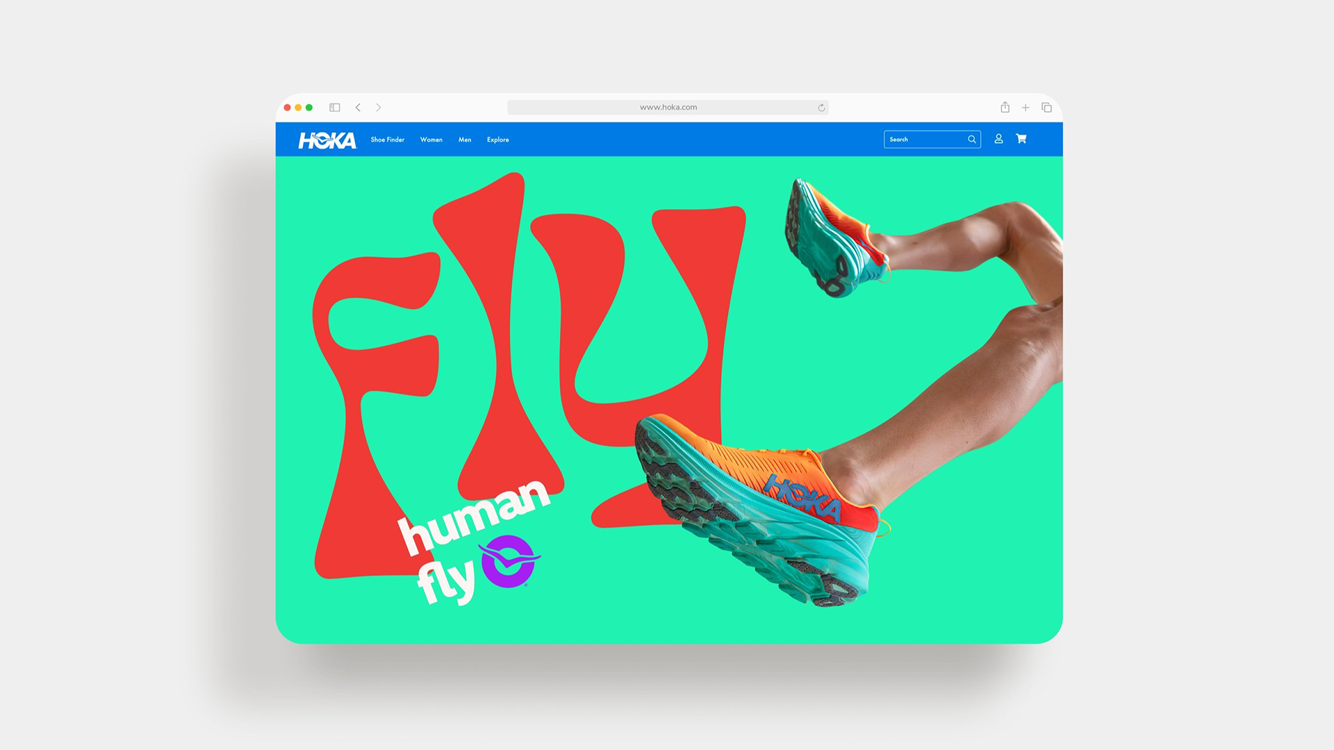
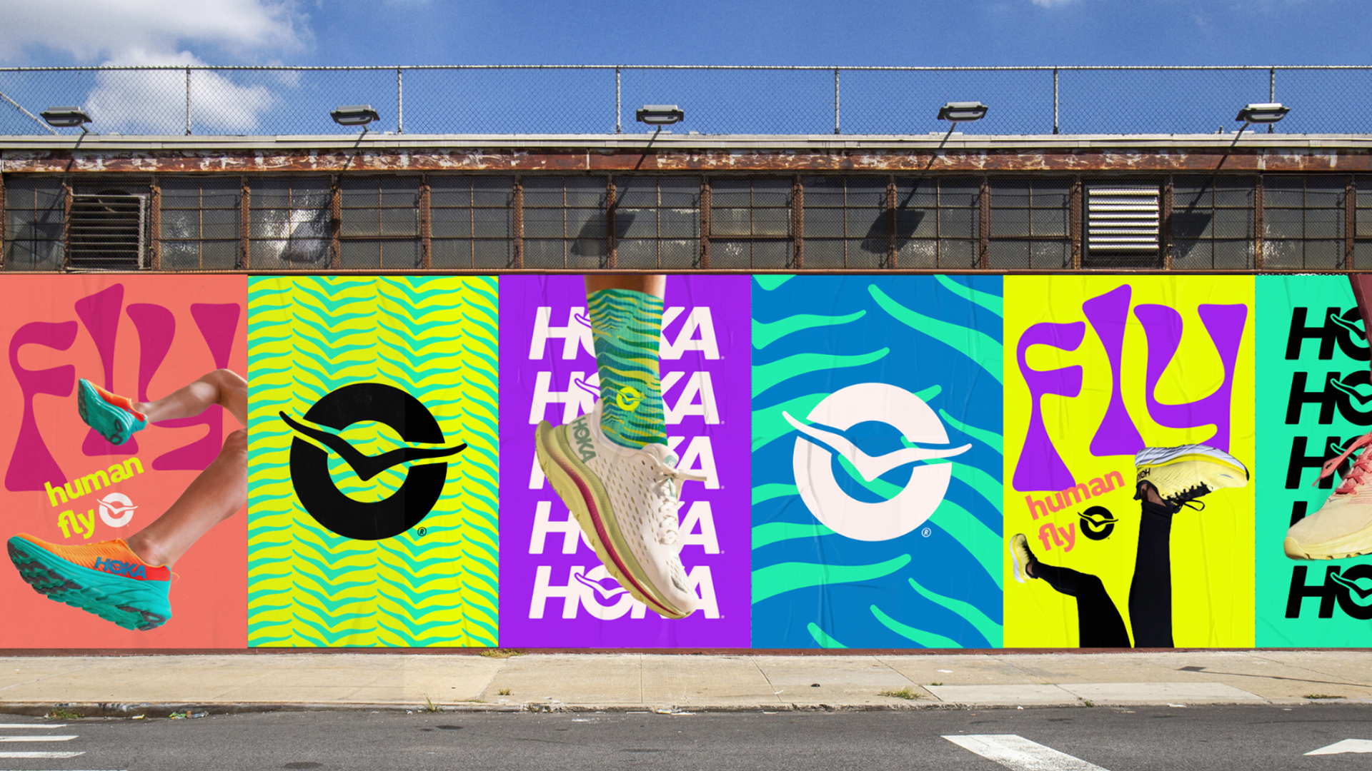
PITCH CAMPAIGN: DESIGN
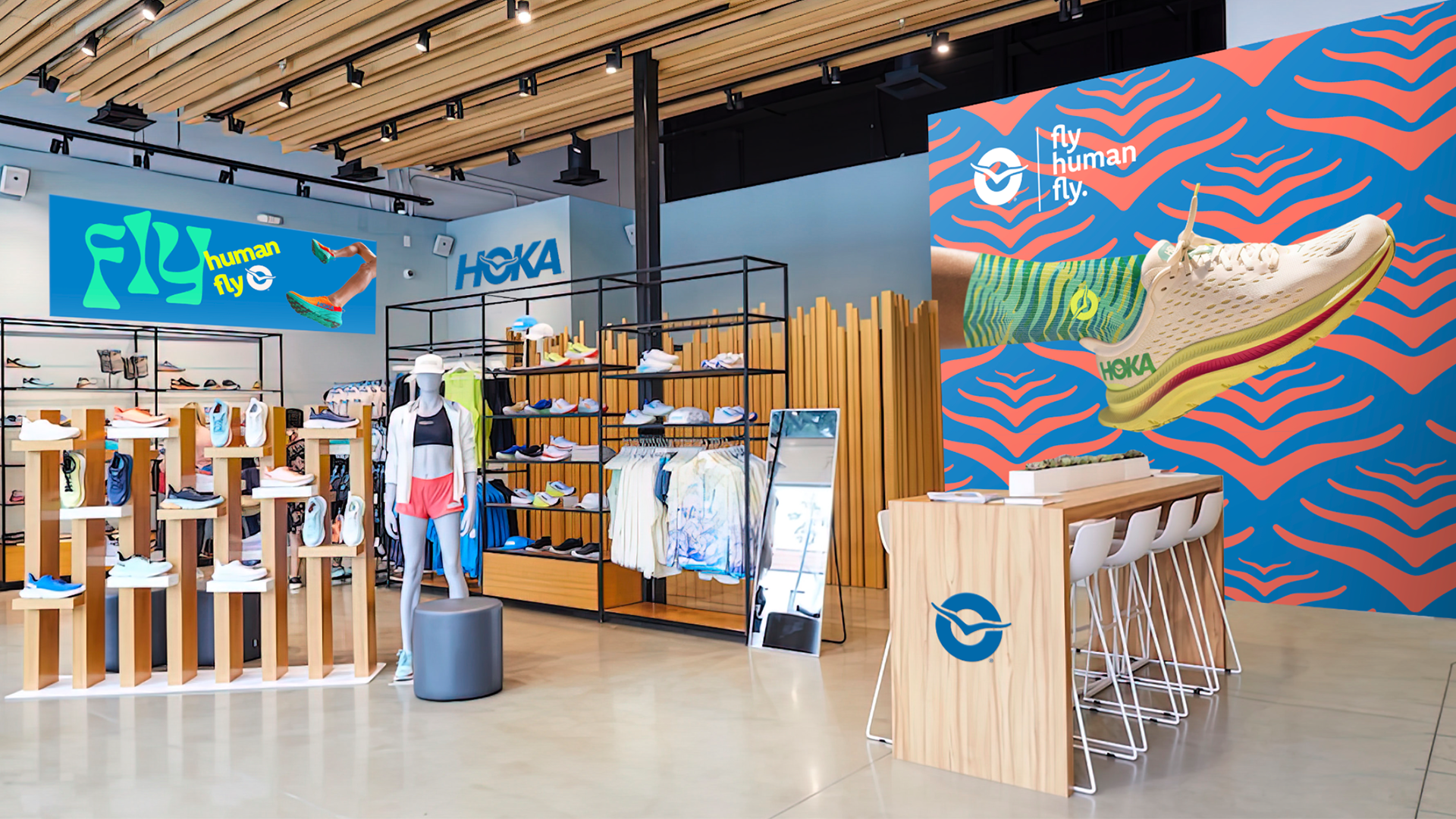
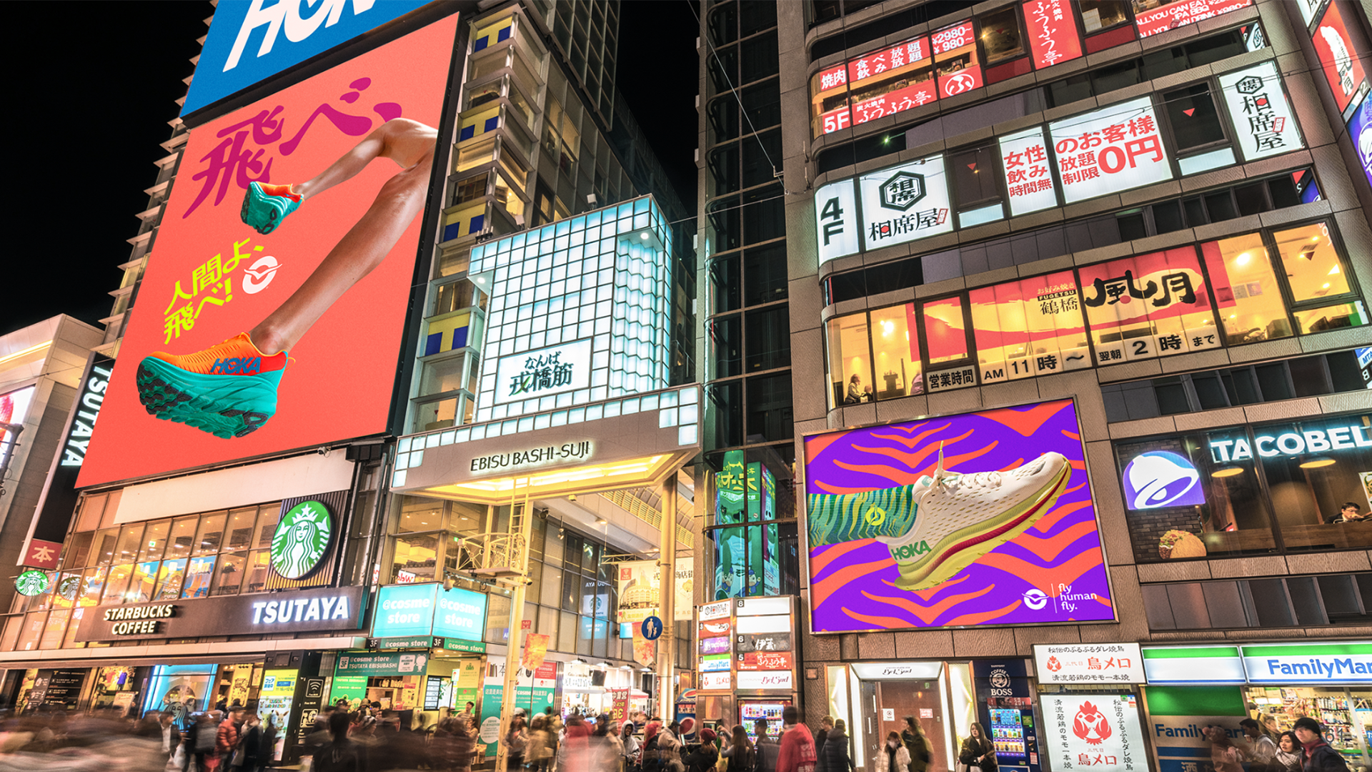
We were tasked with giving the Hoka icon meaning, integrating it into brand communications, and exploring a visual approach that works across high-level branded and product-specific assets.
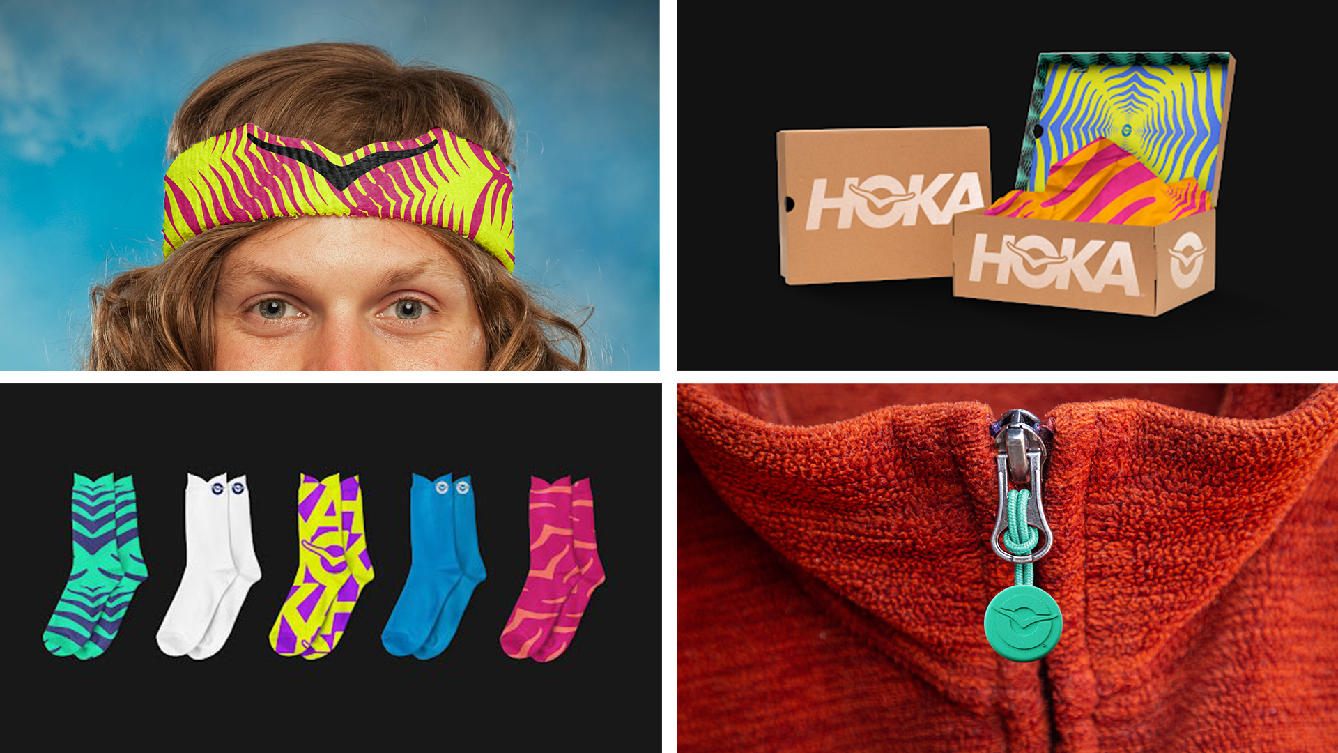
We solved this by fine-tuning the brand’s current logo and creating a robust and ownable “O” to make the bird a strong icon and core design element.
The design is a visual expression of the euphoria or moments of bliss experienced during this high. The exuberant colors represent the endorphins or ‘happy chemicals’ going through the body. The quirky typography is a nod to the wonderfully weird shoes. The Hoka bird is a bold stand-alone element incorporated into cheerful branded patterns.